# Using CSS Variables

### Default Themes

We're using CSS Variables, aka CSS Custom Properties for the theming system. We ship a `light` and a `dark` mode.

{% hint style="warning" %}
For the styles to appear please add `leap-ui` class to a parent element of any component you use.
{% endhint %}

For the theme to be applied, you will need to add `leap-ui` class to a parent element. And to use the dark mode, you'll have to add `dark` class to the same parent element. Here's an example

```tsx
import { useState } from 'react'
import { useTheme } from './use-theme'

const YourDapp = () => {
  // useTheme is just an example hook to get the current theme
  // let's say the theme variable is 'dark' or 'light'
  const theme = useTheme()

  return (
    <div className={`leap-ui ${theme === 'dark' ? 'dark' : ''}`}>
      {/* rest of the UI here */}
    </div>
  )
}
```

### Customisation

The default themes are great starters, however we give you complete control over the theme. However for most dApps, changing a few theme variables is enough. Let's say we're integrating the swaps modal on the stride app, here's the variables I would change

```css
/*
 * The Stride dApp is in light mode, so we will update .leap-ui declaration
 */
.leap-ui {
  /*
   * Stride primary colour is #E50571
   * Convert it to HSL - hsl(331deg, 95.7%, 45.9%)
   * We set the --primary variable to 331 95.7% 45.9%
   */
  --primary: 331 95.7% 45.9%;
  /*
   * Primary Foreground colour - white
   */
  --primary-foreground: 0 0% 100%;
  /*
   * Ring colour - hsl(323deg, 94.2%, 59.2%)
   */
  --ring: 323 94.2% 59.2%;
  /*
   * Background colour - white
   */
  --background: 0 0% 100%;
  /*
   * Foreground colour - hsl(331deg, 100%, 11.8%)
   */
  --foreground: 331 100% 11.8%;
}
```

{% hint style="info" %}
Find the full theme for stride and other dApps here - <https://git.new/elements-themes>
{% endhint %}

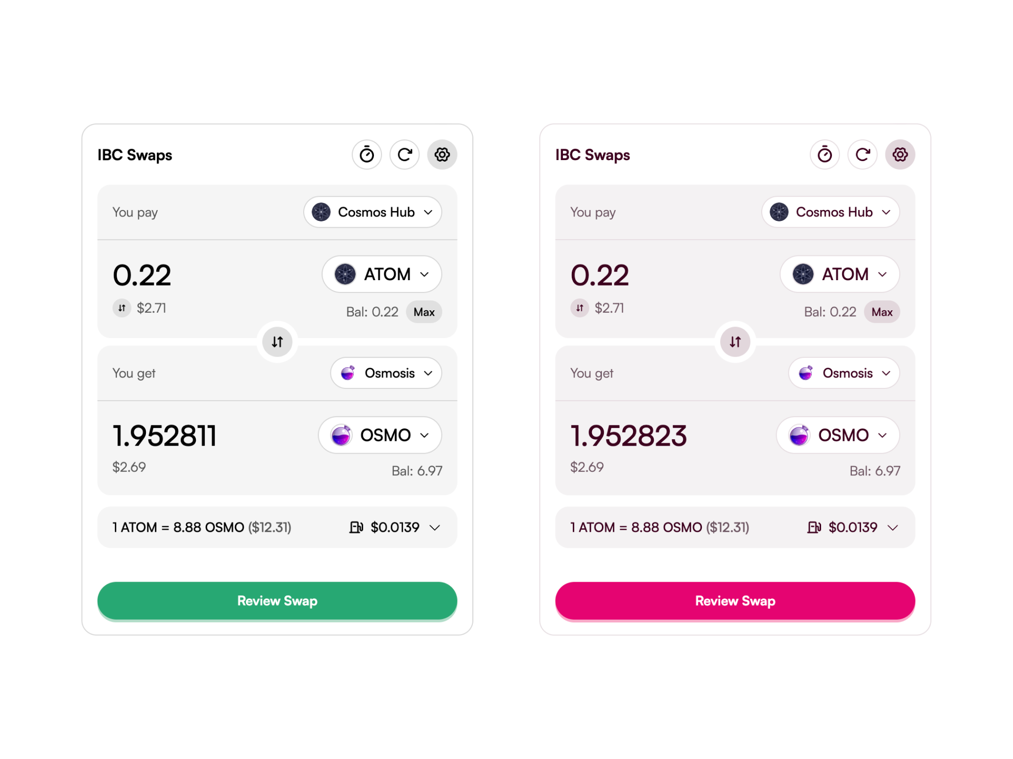
Let's compare the default light theme and the stride light theme

<figure><picture><source srcset="/files/ORvpeRVetzC99Rcacc4c" media="(prefers-color-scheme: dark)"><img src="/files/8bHEin3jj8aHOPBAGpcI" alt=""></picture><figcaption><p>Comparison between the default light mode and the stride light mode</p></figcaption></figure>

If you want the UI to look exactly like your dApp, here's all the CSS custom properties that you can modify with their descriptions

<table><thead><tr><th width="306">CSS Variable</th><th>Description</th></tr></thead><tbody><tr><td><code>--primary</code></td><td>Brand's primary colour, utilized for backgrounds of buttons, active links, and similar elements.</td></tr><tr><td><code>--primary-foreground</code></td><td>Text colour designed to contrast with the <code>--primary</code> background, ensuring readability.</td></tr><tr><td><code>--secondary</code></td><td>Secondary colour option, intended for less prominent actions such as settings or navigation buttons.</td></tr><tr><td><code>--secondary-foreground</code></td><td>Foreground colour for text placed over <code>--secondary</code> backgrounds, providing clear visibility.</td></tr><tr><td><code>--background</code></td><td>Background colour for the entire application or site. Typically light to enhance readability.</td></tr><tr><td><code>--foreground</code></td><td>Foreground (text) colour used against the <code>--background</code>. Usually dark for contrast against a light background.</td></tr><tr><td><code>--card</code></td><td>Background colour for card components. Lighter shade for differentiation from the main background.</td></tr><tr><td><code>--card-foreground</code></td><td>Text colour for content within card components, contrasting with <code>--card</code>.</td></tr><tr><td><code>--popover</code></td><td>Background colour for popover elements like tooltips or dropdowns. Similar to <code>--card</code> for consistency.</td></tr><tr><td><code>--popover-foreground</code></td><td>Text colour within popover elements, ensuring legibility against <code>--popover</code> background.</td></tr><tr><td><code>--primary</code></td><td>Represents your brand's primary colour. Used for button backgrounds, active links, etc.</td></tr><tr><td><code>--primary-foreground</code></td><td>Colour for text that's put on an element with <code>--primary</code> background colour.</td></tr><tr><td><code>--secondary</code></td><td>A colour for secondary actions like a settings or a navigation button.</td></tr><tr><td><code>--secondary-foreground</code></td><td>Colour for text that's put on elements with <code>--secondary</code> background colour.</td></tr><tr><td><code>--muted</code></td><td>A softer or more muted colour, possibly for less prominent elements or disabled state.</td></tr><tr><td><code>--muted-foreground</code></td><td>Foreground colour for text or icons against the <code>--muted</code> background, ensuring visibility.</td></tr><tr><td><code>--accent</code></td><td>An accent colour used sparingly to draw attention to specific components or elements.</td></tr><tr><td><code>--accent-foreground</code></td><td>Text colour that contrasts with the <code>--accent</code> background, used within elements like badges or tags.</td></tr><tr><td><code>--success</code></td><td>Colour denoting success, often used for success messages, confirmation icons, etc.</td></tr><tr><td><code>--success-foreground</code></td><td>Text colour for elements with a <code>--success</code> background, ensuring clear visibility.</td></tr><tr><td><code>--destructive</code></td><td>Colour used to denote destructive actions, like delete buttons. Bright to draw attention and caution.</td></tr><tr><td><code>--destructive-foreground</code></td><td>Colour for text on destructive elements, ensuring legibility.</td></tr><tr><td><code>--warning</code></td><td>Warning colour used for alerts and cautionary elements. Bright and noticeable.</td></tr><tr><td><code>--warning-foreground</code></td><td>Text colour against the <code>--warning</code> background for clear legibility in warnings.</td></tr><tr><td><code>--border</code></td><td>Colour used for borders around elements or divisions. Light to subtly define space and boundaries.</td></tr><tr><td><code>--input</code></td><td>Background colour for input fields, often matching <code>--border</code> for consistency in form elements.</td></tr><tr><td><code>--ring</code></td><td>Colour for focus rings around interactive elements, providing accessibility and visual feedback.</td></tr><tr><td><code>--radius</code></td><td>Standard border radius for elements, contributing to the overall design system's feel.</td></tr><tr><td><code>--blur-overlay</code></td><td>Blur intensity for overlay elements, such as modals or backdrop filters.</td></tr><tr><td><code>--font-family</code></td><td>Primary font family for the application, ensuring a consistent and readable typography across the platform.</td></tr></tbody></table>

### Troubleshooting Common Issues

**>>> The default styles for elements are not coming up**

It's most likely because you haven't  added the following CSS import to your app

```jsx
import '@leapwallet/elements/styles.css'
```

#### >>> **I have customised the CSS variables, but it doesn't change the theme**

This happens due to the [cascading nature of CSS](https://developer.mozilla.org/en-US/docs/Web/CSS/Cascade). Here's a few solutions (in-order) you should try

*#1* Import your customisation styles after element's stylesheets

```jsx
import '@leapwallet/elements/styles.css'
import './styles/elements-customisations.css'
```

*#2* Add an additional selector to the customisations block

<pre class="language-css"><code class="lang-css"><strong>.leap-ui.my-dapp-class {
</strong>    --font-family: 'Helvetica', 'SF Pro', sans-serif;
}
</code></pre>

```jsx
const YourDapp = () => {
  return (
    <div className={`leap-ui my-dapp-class`}>
      <IBCSwaps />
    </div>
  )
}
```


---

# Agent Instructions: Querying This Documentation

If you need additional information that is not directly available in this page, you can query the documentation dynamically by asking a question.

Perform an HTTP GET request on the current page URL with the `ask` query parameter:

```
GET https://docs.leapwallet.io/cosmos/elements/theming/using-css-variables.md?ask=<question>
```

The question should be specific, self-contained, and written in natural language.
The response will contain a direct answer to the question and relevant excerpts and sources from the documentation.

Use this mechanism when the answer is not explicitly present in the current page, you need clarification or additional context, or you want to retrieve related documentation sections.
